This article is part 2 of 6 from our upcoming eBook: Hacking Growth With the Rule of 72. Pre-order your free copy and receive it automatically when it’s launched.
Congratulations, you’ve increased your traffic. But can you make the visitors stick around, and turn them into users? You still have to guide the visitors through the whole signup process and convert them into customers.
Otherwise, you won’t be able to show them how amazing your product really is, and your revenue won’t increase either.
In this article we show you how to optimize your SaaS conversion rate and double your growth, with the rule of 72.
Guiding the Visitor Through The Journey
So how do you make you user understand that your product is going to improve his life? Let’s think a bit about the steps he has to take in order to get there.
When a new visitor comes to your website he lands on a page. It’s completely up to your business whether he lands on the homepage, or a custom landing page tailored for that specific traffic source.
But once he’s on the landing page, you need to convert him into a user. He has to go through the signup process. There is no other way around it.
The way you present your visitors with the signup form and how you design the signup process will have a huge influence on his decision to finish the onboarding process and eventually become a customer.
The signup process is a challenge for every business because this is where you begin asking the visitor for his personal information. He has to create an account in order to be able to use the app.
Up until this point the visitor hasn’t received anything but a promise, so you have to be very careful about how you approach the way you ask him for his details.
Tailoring a Great Signup Experience For Your User
The good thing about the signup process is that you can design it in such a a way that it can become an actual delight for your user. But we’ve seen plenty of cases where it’s otherwise.
Here at InnerTrends we like to break things down. Not literally, but in a way that make it easier for us to understand them. The two steps that have the greatest influence upon your visitor’s decision to sign up are:
- The Signup Form
- Your Signup Strategy
We’ve written before about the pros and cons a signup strategy can have. You can check out our article on Fast vs. Considered Signup to learn the difference between the two.
Today we’re going to walk you through a step-by-step process you can use to increase the conversion rates by having more visitors complete the signup form.
We’re going to use the two companies we’ve talked about in Part 1 of the series in order to how you can implement the framework for your SaaS business.
They’ve both increased their traffic by 12%. Before we get into specifics here’s their funnel so we can get a quick refresher about here they’re at:
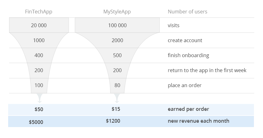
Both FinTechApp and MyStyleApp have a freemium offering and their business success relies on how many users decide to try out their products.
This makes it really important for them to have a large number of visitors fill out the signup form. Driving more visitors to fill out the signup form will increase the conversion rate and, in turn, the revenue.
Both companies use their homepages as the main source of leads and are doing all they can to convert these visitors. Their current conversion rates are:
- FintTechApp: 5%
- MyStyleApp: 2%
Let’s have an in-depth look at what can be done to increase those conversion rates.
How to Drive Up the Conversion Rate of Your SaaS
We’ve already emphasized that by breaking thing down we can understand them more easily.
We already know that it’s the signup form can influence the user’s decision to signup, so we can work our way from there.
The next step is to find out if the signup form is good or bad. How do you find out if your signup form is a good or bad fit for your business?
You can A/B test it against another version and analyze how each of them perform.
If you don’t know where to start, we suggest having a look at other successful SaaS companies. Try to understand what makes them so good.
Go through the signup process and become aware of how effortless (or dreadful) the whole experience canbe.
There’s no “one size fits all” solution, but you might be able to identify a few ideas to help you run your A/B tests.
A/B testing is the method that every company can employ to optimize their conversion rates.
In order to find out what kind of tests they can run, FinTechApp and MyStyleApp conducted some research to see where it would be best to spend their resources.
They have analyzed the signup pages of over 40 SaaS companies and classified them, in order to gain a better understanding of the pros and cons each type of signup form provides.
Here’s how they’ve classified the signup forms they found:
Short and Extra Short Signup Forms
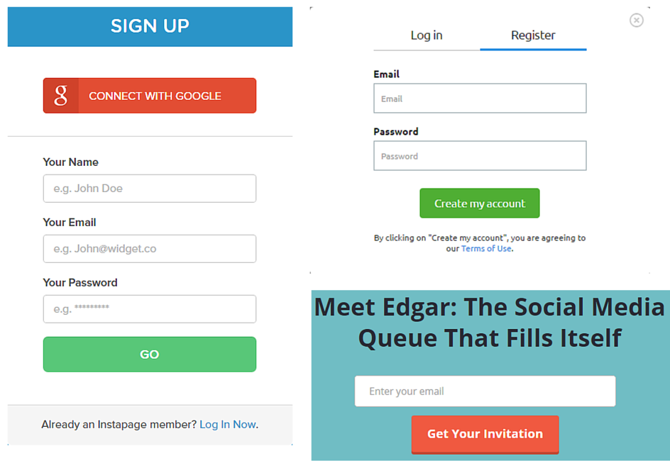
The short and extra short signup forms are designed to collect a large number of leads.
They do a good job of reducing friction to a minimum. However, this kind of form doesn’t guarantee a 100% conversion rate just because the friction is less.
This type of form is best used when the company isn’t in a position to provide a big incentive to convince visitors to provide their personal details.
The short signup forms are mostly used by companies looking to get a large number of users.
They can help you collect a large number of leads which can be pursued later. Also, you will be able to run faster A/B tests.
How To Optimize Short and Extra Short Signup Forms
As far as its length goes, there’s little you can do to a form like this to make it shorter.
You could experiment with the incentive and the messages that are being shown to the visitor.
These will have the biggest influence on a user’s decision to go through this step.
One other way to find out what works is to A/B test the form’s positioning and messaging.
This strategy is quite common to apps who are in early release or private beta and want to find out how to position themselves on the market.
Last but not least, you could try adding a social signup button to the form. Visitors may be reluctant to provide you with their email address, but they trust a social network to protect their privacy.
If you decide to experiment with adding a social signup button, make sure you don’t forget to split test the social networks to see which one works best for your app. Begin with the ones where your customers usually hang out.
Takeaway
The message you display and the positioning of the signup form could improve the conversion rate.
Medium Sized Signup Forms
Qualaroo
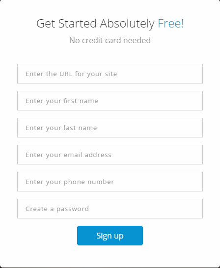
If the purpose of a short signup form is to get a large volume of new accounts, no matter their quality, the mid-sized form objective is to get leads that are, at least, a bit interested in using the product.
The visitor will start providing his personal information and filling out the form, only after he becomes interested in the promise that your landing page has made to him.
One thing we often notice in medium sized signup forms is that they ask for too much information.
There’s no need to place ten fields in your form if you only need to know four things about your user.
Each field in the form only adds to the friction and can influence your visitor’s decision to abandon the signup process.
How to Optimize Mid-Sized Signup Forms
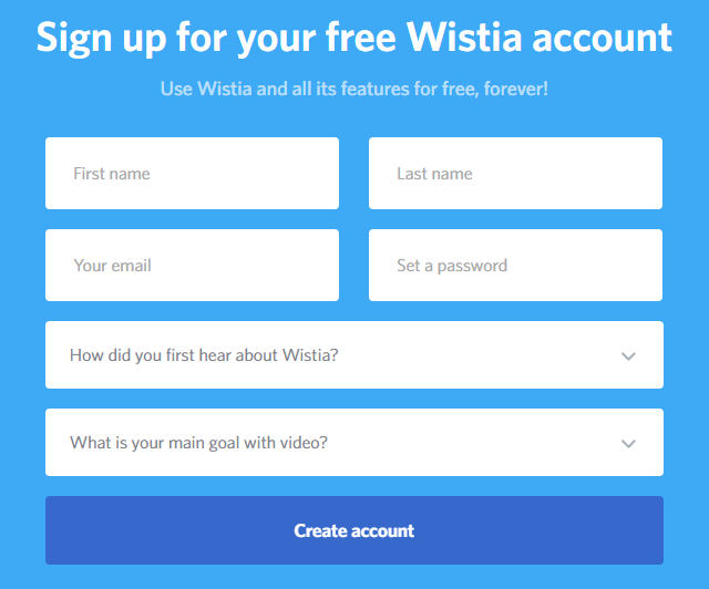
A common practice we’ve seen used by companies with this type of form is scoring. I’m sure you’ve stumbled across signup forms with fields that ask you about your company’s size, or “how did you hear about us?”.
Another way to optimize mid-sized signup forms is to split test a form version which tells the user the exact reason behind every form field.
The information collected through the mid-sized forms usually goes through a filter.
If you have a field asking who referred the user to you, tell them that you’ll give the referrer a small gift. Help the user understand why you’re requesting their personal information.
Whether it’s a human filter or an automated one will depend on the company who collects the information but it’s important to mention that the information is being used to learn more about the lead.
Medium Sized Signup Form + Scoring
Wistia
Multiple Steps Signup Forms
LiveChatInc
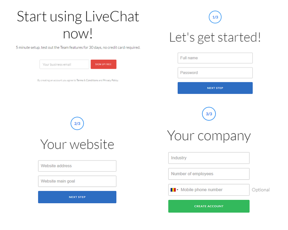
Multiple Step Forms are like a mid-sized form disguised as three very short forms.
It wasn’t used that often in the past but we’ve seen it gain traction more recently. In particular, apps developed by Google use it a lot.
Multiple Step Forms are very good at reducing friction because it leaves the user under the impression that he’s providing a small amount of detail but you’re getting the amount of information similar to that in a mid-sized form.
Another benefit of this kind of signup form is that it allows you to explain in more detail why you need that specific information from your users.
You might not be able to explain to them why you need so much information if you go for a regular mid-sized form so splitting it up into multiple parts makes it a lot easier.
Also, the multiple steps signup form can be used as a solution or split test variant for the mid-sized form.
Widget Signup Form
Basecamp
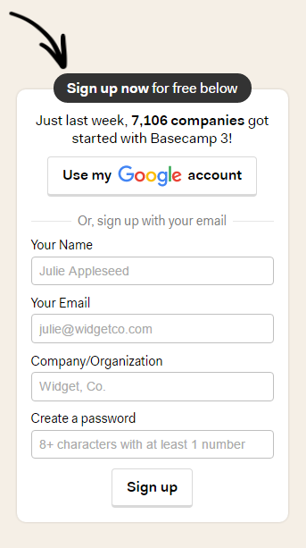
This type of signup form is tied to the context in which the user finds himself. It allows him to sign up, on the spot, once he made the decision to do so.
If you’d like to experiment with this type of sign up form, we’d recommend having a look at how Basecamp implemented theirs.
Their sign up form has an incentive, an option to use a social network to create the account, and the form is short and well explained.
It’s only asking for basic information and it shows the visitors exactly what it’s asking for.
Upfront Payment Details
Ahrefs
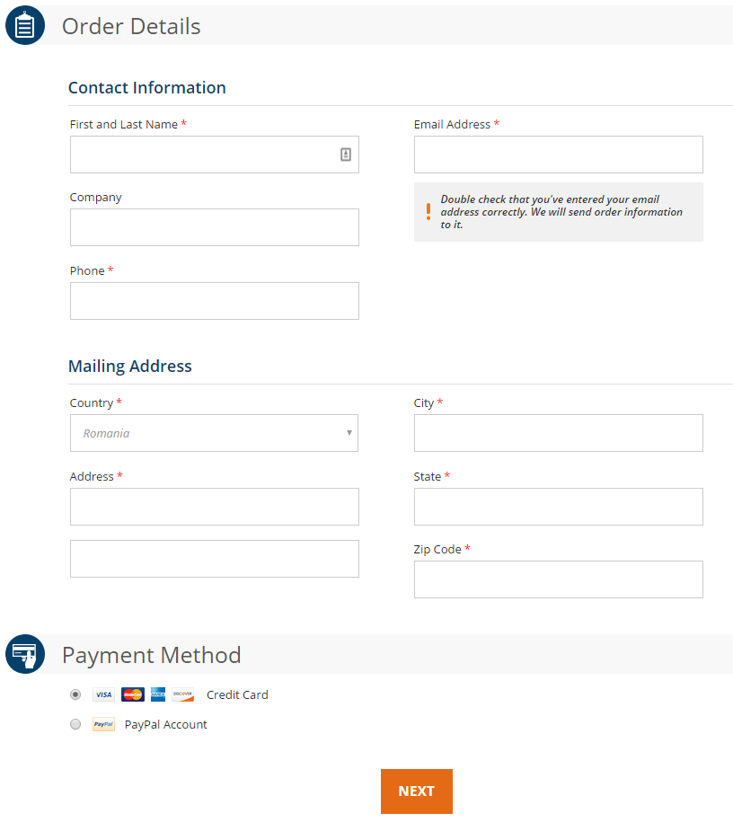
This type of signup form aims to collect leads or users who are strongly committed to using the product.
We wrote a whole article where we broke down the pros and cons of this signup form: Fast vs. Considered Signup
Long forms asking for payment details are mainly used by companies who provide a lot of value from the get-go, during the trial period.
The considered signup asks for a lot of details upfront. For the visitors, the friction is about as high as it gets.
That’s why only a person who is committed to using your product would provide all their details.
This type of signup form is mostly used by apps who run the risk of being exposed to free trial exploitation.
That’s why they ask for a payment method upfront. There have been cases where users kept creating new accounts instead of paying for a service.
How to Optimize the Upfront Payment Details Form
Optimizing this kind of signup form requires providing a very clear explanation to the user that he can stop the credit card payments at any moment if he wishes to do so.
Also, it’s very important to let him know that his information is stored on secure servers, and provide any additional information that will help him understand that there’s no risk involved in using your product.
If you plan to ask for your user’s credit card details, you will end up with a long signup form. The best you can do is to make it as good as you possibly can.
Testimonials could help, they may help provide reassurance from other human beings that it’s worth inserting the credit card details.
Setting Expectations and Conducting Your A/B Test
After finding out what they can experiment with, our two companies can decide to implement the following steps in order to increase the conversion rate by 12%:
B2B Apps
FinTechApp will need to increase their conversion rate from 5% to 5.6%. To be able to validate such an increase with a statistical significant result, FinTechApp will need to run an A/B test on almost all its traffic for at least a whole month.
Since they offer a B2B solution, the best approach for them would be to implement a considered signup featuring a medium-sized form. This would be a good fit for them because they aren’t looking to collect a large amount of leads.
They are more focused towards a small number of targeted leads committed to using the product.
They could even take this a step further and implement a scoring question inside the signup form.
This would help them learn more about the lead and come up with a customized solution for that specific lead’s profile when they follow up with it.
If their first A/B test does not cut it, it’s possible that the goal of getting that 12% increase could be two or even three months away.
However, it’s just a matter of time before they’ll reach a conversion rate of 5.6%.
B2C Apps
On the other hand, MyStyleApp has a conversion rate of 2% and it only needs to increase it to 2.24% to reach the goal it set itself.
Because their app is oriented towards the B2C market, they have decided to implemented a fast signup for their product.
The best approach for this scenario would be to implement a short signup form with a social signup button. This will help them gather a large amount of users for the app.
Ask users to invite their friends to the app. This isn’t necessarily related to the conversion rate, but they could use this hack to increase their user base, therefore generating more traffic.
They could even experiment with the social signup buttons from different social networks, but for now they should stick with the one that their audience hangs out on most often.
In order to reach their goal of converting 2.24% of the visitors, the existing traffic allows for at least two A/B tests per month, making the time to reach this goal much shorter than in the case of FinTechApp.
If you’d like to read more on this topic, these are some cool case studies about landing page conversion optimization A/B tests with some impressive results:
- 100 Conversion Optimization Case Studies
- 6 Of My All-Time Favorite Conversion Rate Optimization Case Studies
- 5 Travel Industry Conversion Optimization Case Studies
Stay tuned for part 3 where we’ll show you how the onboarding rate can be increased by 12%.
Looking for deep insights into how your customers use your product?
InnerTrends can help. You won’t have to be a data scientist to discover the best growth opportunities for your business, our software will take care of that for you.
Schedule a Demo with us and witness with your own eyes just how powerful InnerTrends can be.