Step 2 of 5 on how to double your SaaS revenue using the rule of 72.
You’ve improved the traffic to your website, Step 1. Good job!
|
Overview: Getting Started with the Rule of 72 for Doubling your SaaS Revenue |
| Step 1: Visits – From Stranger to Visitor |
| Step 2: Creates Account – From Visitor to Sign-up |
| Step 3: Get Onboarded – From Sign-up to Onboarded User |
| Step 4: First Week Retention After Onboarded – From Onboarded User to Returning to the Product within 1 Week |
| Step 5: Upgrade to a Paid Account – From First Week Retention After Onboarded to Paying Customer |
Now what? The next step if you hope to double your revenue using behavioral analytics and our rule of 72 is to improve your sign-up conversion rate, in other words getting more visitors to create an account with your product.
According to our rule, we need to improve your conversion rate of visitors to sign-ups by just 15%. To put some context around what this means, imagine that your product normally gets 10,000 visitors a month out of which 500 create an account. To improve your sign-up conversion rate by 15% you would need to get an additional 75 of your visitors to create an account each month to be on your way to doubling revenue for your SaaS business.
So what’s the best way to optimize your signup process?
- Understand your best marketing channels
- Review your sign-up intent pages and sign-up process
- Take a hard look at your signup form.
Know your Best Marketing Channels
One of the best places to start is to first understand which marketing channels are converting the most visitors into created accounts. While we are at it and since we are also looking for full customer journey optimization within our bigger picture goal of doubling revenue, it would be smart to also understand which channels are giving us the most onboarded users and users that upgrade to paid.
By finding your highest performing marketing channels you can begin reverse engineering the journey’s that are helping to drive the key conversions.
In InnerTrends we have a one-click report that will tell you exactly this. Checkout these two articles that will give you more information on how to find your best marketing channels:
- What is the performance of a marketing channel?
- Marketing Attribution for Software: The Best Multi-Touch Model for SaaS
Once you understand your best channels begin to build on top of those and double down on what is working best to help reach your 15% increase in accounts created.
Sign-up Intent & The Sign-up Process
Sign-up Intent is a grouped metric that includes visitor actions that imply that the visitor has intent to sign-up for your software, such as visiting the pricing page or starting a free trial registration. We like to combine all of these visits into a single metric to understand the quality of your traffic.
While the entire sign-up process is a complete set of actions that visitors perform in order to create their account.
So, sign-up intent is only one aspect within the sign-up process, but both are important to understand in order to optimize conversions.
When we ask ourselves what sequence of actions that visitors perform in order to create an account, we most often expect that there are very few options. In reality the visitors’ behavior is very diverse, and so the sequence of actions they perform during the sign-up process has many unexpected variations.
Wouldn’t it be great to know the actions that visitors perform before creating an account that lead to the highest conversions? With this information you could work to create a more focused experience that leads visitors on this journey. Maybe you find that you have multiple ways visitors get to a free trial registration form and by simplifying this journey to an optimized path you could increase conversions.
That’s why at InnerTrends we created this ready-to-use report where you can easily analyze the paths visitors take before creating an account. The report is entitled:
What are the paths that visitors go through during the sign-up process?
Optimizing Your Sign-up Page & Form
The way you present the sign up form to your visitors and the way you design the signup process can have an initial influence on their decision to not only create an account but even finish the onboarding process and eventually become customers.
The signup conversion is a challenge for every business because this is where you begin asking visitors for their personal information. Up until this point, the visitors haven’t received anything but a promise, so you have to be very careful about how you approach asking for their personal details.
If your form is unnecessarily long, your visitor will abandon ship from the outset. If the form asks for credit card information or payment information upfront can also cause friction on free trial offers.
Finding the best sign-up form will depend on matching the needs of the visitor with those of your business.
It’s not about the number of questions you ask in your sign-up form but about the context surrounding the questions in relation to what your product does at its core. If your software helps build better sales teams then you might need to ask how many sales reps a company has, or what CRM they are using. In fact, if you did not ask these types of questions then new sign-ups might actually question how you would truly help build their team at all. So, it’s not about the number of questions but more about how they relate to having success with your product and the new sign-up.
It will be up to you to balance form length with it’s quality and the surrounding influencing factors on the page, such as social proof.
For some additional insight we have analyzed the sign up forms of 40 SaaS companies and broken them down by these 4 categories:
- Short and extra short sign up pages
- Mid-sized sign up pages
- Multiple-step sign up pages
- Upfront payment details
1. Short and Extra Short Signup Pages
Your typical short signup form looks something like this:
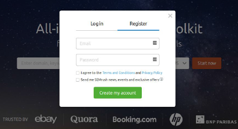
The short and extra short signup pages are designed to collect a large number of leads and less focus on lead quality.
They do a good job of reducing friction to a minimum. This type of form is best used when the company isn’t in a position to provide a big incentive to convince visitors to provide personal details.
The short signup pages are mostly used by companies looking to get a large number of users, because these can help you collect a large number of leads that can be pursued later with product-led growth efforts. As a bonus, this type of sign up page will also allow you to run faster A/B tests since you’ll have more users to test against.
Growth Strategies To Optimize Short and Extra Short Signup Forms
As far as its length goes, there’s little you can do to a short or extra short form to make it even shorter.
You could experiment with running multivariate tests of the CTA’s, page layout and messages that are being shown to the visitor. These will have the biggest influence on a user’s decision to go through this step.
Last but not least, you could try adding a social signup button to the form. Visitors may be reluctant to provide you with their email address, but they trust a social network to protect their privacy.
If you decide to experiment with adding a social signup button, make sure you don’t forget to experiment testing which of the social networks work best for conversions on your sign up.
2. Medium-Sized Signup Pages
Qualaroo provides us with the perfect example of a medium-sized form:
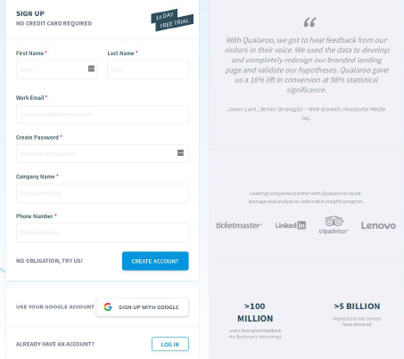
If the purpose of a short signup page is to get a large volume of new accounts, no matter their quality, the objective of the mid-sized form is to get higher qualified leads that are at least a bit interested in using the product.
Visitors will start providing their personal information and filling out the form, only after they become interested in the promise that your landing page has made to them.
Pro Tip: One thing we often notice in medium-sized signup forms is that they often ask for too much information. Be careful with how much you ask for and make sure it relates to the core of your product, not just information you want to collect.
There’s no need to place ten fields in your form if you only need to know four things about your user. Each field in the form only adds to the friction and can influence your visitors’ into abandoning the signup process.
Growth Strategies to Optimize Mid-Sized Sign up Pages
One idea to optimize mid-size signup pages is to split test a form version. Try to understand what form questions are necessary and even which messaging associated with each question helps convert. It can also be helpful to clearly tell the user the exact reason behind every form field, especially if they may question why it is being asked.
3. Multiple-Step Signup Pages
LiveChat uses a multiple-step signup form. Here’s how it looks.
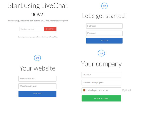
Multiple-step Forms are like a mid-sized form disguised as three very short forms.
Pro-Tip: Multiple Step Forms are very good at reducing friction because they leave the users somewhat feeling committed to take the next small step.
Another benefit of this kind of signup form is that it allows you to explain in more detail why you need that specific information from your users. You might not be able to explain to them why you need so much information if you go for a regular mid-sized form, so splitting it up into multiple parts makes it a lot easier.
Growth Strategies to Optimize Multi-step Forms
With multi-step forms it’s smart to track what steps are causing the most drop-off in the sign-up process and understand the right number of steps that is optimal in reducing this drop-off. Tools like Fullstory that can give you a video playback of each visitor session are great for helping understand if there is any confusion or frustration within each step of your sign up.
4. Upfront Payment Details
For this type of form, Moz provides us with a very good example.
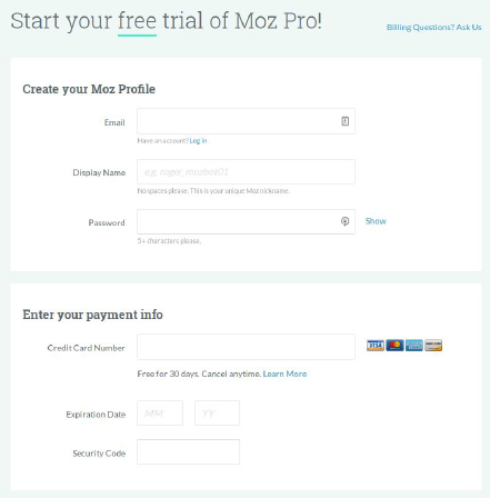
This type of signup form aims to collect leads or users who are strongly committed to using the product.
At InnerTrends we ran an experiment on the pros of Fast vs. Considered Signup. Consider checking it out for more information on this subject.
Pro tip: In general longer forms that are asking for payment details are mainly used by companies that provide a lot of value from the get-go during the trial period.
The considered sign up page asks for a lot of details upfront. For visitors, the friction is about as high as it gets. That’s why only a person who is committed to using your product would provide all their details.
This type of signup form is mostly used by apps that run the risk of being exposed to free trial exploitation. That’s why they ask for a payment method upfront. There have been cases where users kept creating new accounts instead of paying for a service.
Growth Strategies to Optimize the Upfront Payment Signup Form
Optimizing this kind of signup form requires providing a very clear explanation to the users of the value they are getting and that they can easily stop the credit card payments at any moment if they wish to do so.
It’s also very important to let them know that their information is stored on secure servers, and provide any additional information that will help them understand that there’s no risk involved in using your product.
Pro top: It’s great to offer a money back guarantee to help reduce friction on sign up for companies that ask for credit card information or payment up front.
If you plan to ask for your user’s credit card details, you will end up with a long signup form. The best you can do is to make it clean and clear as you possibly can.
Testimonials are also a great way of increasing trust, they provide reassurance from other users that it’s worth inserting the credit card details.
Recap of Step 2 of 5 to Double Your SaaS Revenue
Initially, for our SaaS product example, 5% of visitors created an account.
| 10,000 visits |
| 5% conversion rate |
| 500 accounts created |
Following our growth strategy to double the revenue of our business, we know that we need to improve this step of the SaaS customer journey by 15% (From 5% to 5.75%). This means that we need to get an additional 161 of our visitors to create an account.
| 11,500 visits |
| 5.75% conversion rate |
| 661 accounts created (Increase of 161) |
For our example SaaS product we were using an extensive Medium-Sized sign up form asking for a lot of extra details that weren’t crucial to the success of a user.
To start we optimized the details being asked and changed the type of form that we use from a Medium-Sized sign up form to a Multiple-Steps Signup.
By making these changes we end up with a Multiple-Step Sign up Form that feels like two Short Signup Forms which resulted in reaching its goal of an additional 161 visitors creating an account to use the product.
So what do you do with all those new accounts being created to try your product? Make sure that they experience the value of your product by properly onboarding them.
In the next chapter, we will be looking at growth strategies for improving user onboarding and the percentage of new users that experience the value of your product.
Get the Complete eBook on How To Double Your Software Revenue
While we’ve covered a lot in this post, believe it or not, we’ve barely scratched the surface of things you can do to double revenue in your SaaS company. We invite you to download the complete eBook to get insights on the rest of the steps for doubling the revenue of your business
