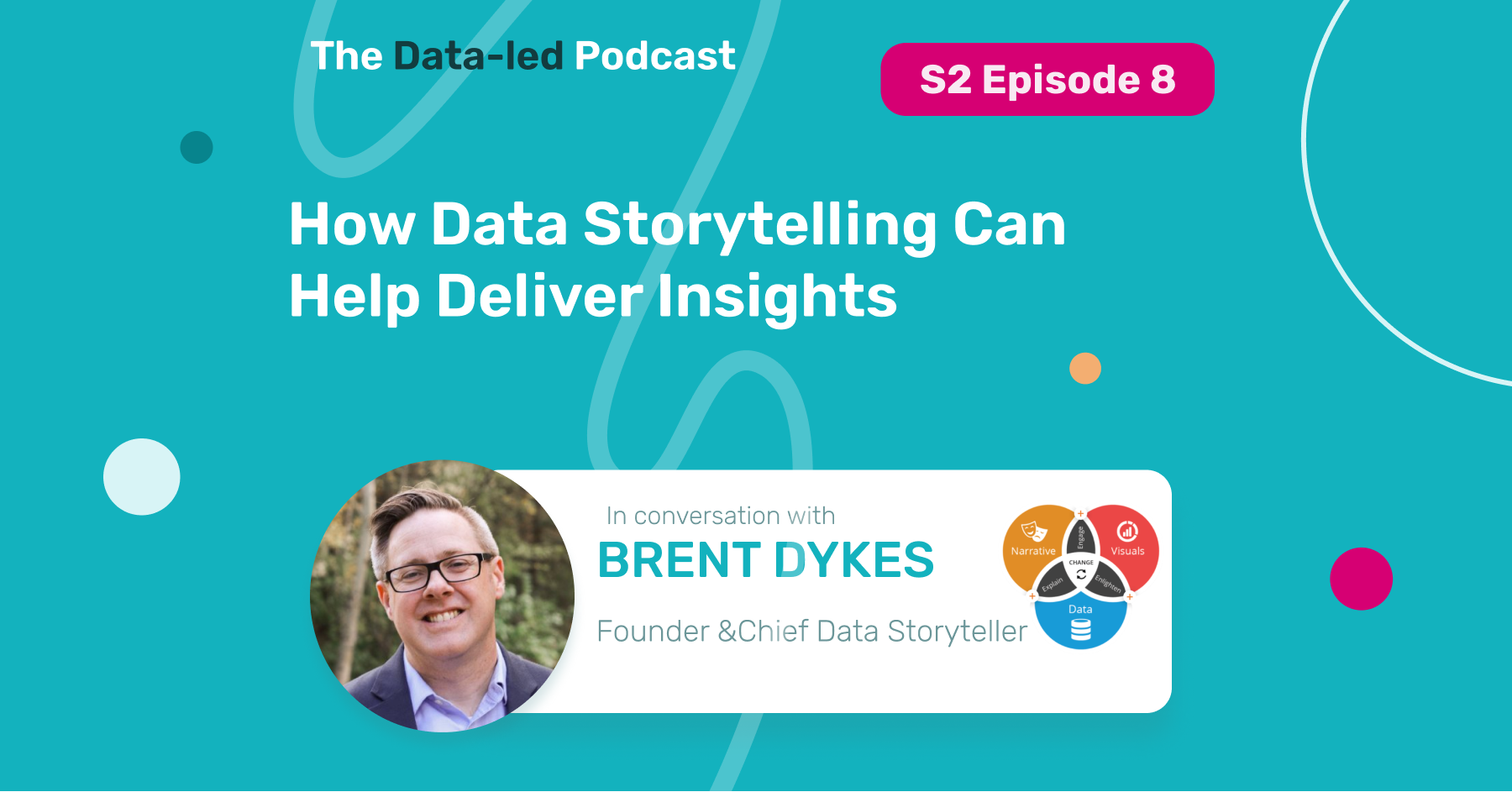
In this podcast episode, join special guest Brent Dykes, Chief Data Storyteller at AnalyticsHero and author of Effective Data Storytelling: How to Drive Change with Data, Narrative, and Visuals., and our host Claudiu Murariu, CEO and Co-Founder of InnerTrends, as they dive into Data Storytelling.
Here’s what they talked about:
- What is the point of telling stories with data
- What are the elements that make up a compelling data story
- What’s the difference between data story framing and data storytelling
- What is data forgery, and why should we be on the lookout for it
Listen to the whole episode here:
Subscribe on your favorite streaming platform for more episodes:
Listen on Apple Podcasts Listen on Spotify Listen on Google Podcasts Listen on StitcherAs data lead professionals, we frequently believe that our job is just to find insights that will lead us to better outcomes.
But this belief often leaves out an essential component, from finding insight to making a decision and acting on it. And that component is communicating those insights to our teams and managers and convincing them that the decisions we are about to make are the best ones.
And this is where the subject of today’s episode comes into play, data storytelling.
Where did the obsession with data storytelling start?
[B]: During my career in analytics and data, I found that many people were struggling with presenting and communicating information. When they found an insight, they could not express it clearly. And because of that, it would often lead to no action.
If you work in data and analytics, you know how hard it is to get to that point where you’ve got an insight. It can be frustrating to mess it up on that last little bit of the journey and see it not cross the finish line. But telling a story around the numbers or the data can help it cross the line, deliver value and have it acted on.
[C]: Your book has addressed this topic with a beautiful story about a doctor who found an amazing insight but failed to communicate it.
[B]: His name is Ignaz Semmelweis. And he worked in Vienna back in the mid-1800s.
He had a problem in the university hospital where he was the chief administrator.
There were two clinics, one clinic taught student doctors, and then another clinic taught midwives. They noticed that, at that time, many women were dying from something called Childbed fever. They didn’t know the cause of it. And when analyzing the mortality rates in these two clinics, they noticed that at the doctor’s clinic, the mortality rate was more than double that of the midwives clinic. They had no idea what was causing it.
One day, a fellow doctor at this hospital was performing an autopsy on a woman who died from this fever, and one of the other student doctors cut his hand while performing the autopsy.
Sure enough, that wound got infected, and he died shortly after. Ignaz was performing the autopsy on this doctor when he discovered this insight.
The pathology of how this doctor died was similar to how the women were dying. That’s when the connection started to form in his brain.
He realized that the student doctors were performing autopsies on the dead women in the morning and doing examinations around the clinic later in the day.
He didn’t know about germ theory, but he hypothesized that some particles were being passed from these corpses to the healthy women that were making them sick, leading to higher mortality rates.
He instituted a hand-washing policy, and for the next 18 months, he was able to show that it could lead to a significantly lower mortality rate.
However, his superiors wouldn’t accept it. They couldn’t believe that the doctor’s hands were the ones that were killing these women.
He published his findings in a journal article using 60+ tables. He called the existing establishment of obstetricians, murderers, and ignoramuses and waited ten years for his conclusions to take off, but they never did.
That’s an example of someone who had an insight and couldn’t get his points across to the audience and ultimately died, never seeing any of his work adopted or having an impact.
Just imagine how many 1000s of lives could have been saved by having his hospital and other hospitals around Europe adopt this hand-washing practice.
How to deliver insights?
[B]: An insight is an unexpected shift in the way we understand things. So there’s already a current understanding of how things operate; there’s already a narrative.
As human beings, we operate on narratives. And when we find an insight, it completely changes our perspective.
We have to not only ram the new data point into the existing narrative and hope it’s going to stick; we have to replace the current report with a new narrative, which obviously encapsulates our new insight.
How to connect that with the audience?
[B]: Connecting with your audience is a big part of data storytelling.
That’s a challenge we all get into when we look at the numbers, and it is evident numbers speak to us, and it feels like they’re telling us a story.
But when we take that same data and share it with others, they have a different context, perspective, experience, or context we’ve gotten, having spent time with the numbers.
So it’s our job as data storytellers to bridge that gap, to help other people see the insight the same way we do. We can’t expect other people to see what we see naturally. They have different backgrounds, different experiences, and different narratives in their minds, which we must overcome.
Ignis wasn’t very successful at doing that. That’s why I share that example. Because he had a great insight that could have saved many lives, and it was really on him to do that.
In the book, I share examples of others who were successful in the same period, even in the same medical field. One was Florence Nightingale, and the other was Dr. John Snow. Those are two examples of other people who had an insight but could tell a data story and drive action. In contrast, Ignaz Semmelweis wasn’t successful in his communication efforts to get his insights adopted. So, yes, the communication process is essential.
How to create a story with data?
Each one of us has a narrative in our mind. When we find an insight, it’s often a narrative that gets us to that insight.
[B]: It usually starts by looking at the data. We find something and dig into it. We do some analysis and flush out the details.
Now we’ve got a bunch of findings, and then what do we do with them?
The next step is to take that and put it into a narrative.
Many people are familiar with the story structure with a beginning, middle, and end.
I found that structure not that useful because I can look at a report with a beginning, middle and end, but that’s not a story.
On the other hand, if there are 17, or 12 different stages in a business scenario, if I’m trying to communicate an insight, that’s going to be very hard to map something to all these different stages.
There is a better model for data and how we do that. It’s really about establishing what the setting is. What are we looking at? What kind of data is there? And what time period?
It is about establishing what we expect to see in this data.
Then, you have what I call the hook, which is that inciting incident that launches our story.
We notice something in the data that stands out, like an observation. It’s not an insight because we haven’t gotten into the” why?” yet, but we’re definitely interested in it.
From there, we start to look at what’s behind this pattern. It looks like an onion; we dig into the layers and reveal more and more until we build up to the climax.
The climax is the aha moment in a data story, where we’ve now discovered an insight.
And the next step of the story’s journey is to find out how to act on this.
So that’s how we take findings. And that narrative structure comes together.
The last step is to visualize everything and ensure that the information is clear and the key points are coming across.
Often, when talking about data storytelling, a lot of the emphasis is placed on the visuals neglecting the narrative part. But, as you can see, the narrative is the core component, the spine of everything we have in a data story.
As I call it in the books, the visualizations are the data scenes. We are building from this foundation of data. We’ve got the structure on top of that foundation with a narrative; the visuals are the last piece. That’s where we start bringing the furniture into the house, organizing things, and making it comfortable.
The narrative is the backbone that ties the data to the visuals and ensures you have meaningful communication going to your audience.
Data storytelling VS Data story framing
[B]: We could assume that we always have to tell everything as a data story. And I would say no; you don’t.
There are specific moments in times when you tell a data story.
A simple way to look at this is when you’re doing a status update. Is there a story? No. You probably provide an update on what’s changed or how things are progressing. And there may not be an insight. Nothing jumps out as unusual or unexpected, or maybe even anything that requires action.
In that case, it is just following best practices around communicating things.
I don’t necessarily need to form things into a narrative and all of that.
In those situations where you have a significant insight, it requires action. There may be a challenge where you’re getting people to agree to that, or there’s already a narrative preventing people from embracing this new insight.
That’s where you need to take the time to invest in building a data story.
So, if it’s a medium to high-value insight, and you anticipate there will be some resistance to embracing that new insight. Those are the moments when you need to tell a data story outside of that.
There may be a situation where you’ve got more information and add to an existing narrative. In that case, you’re not replacing the narrative; you’re just adding to it.
In those cases, it’s not really about you not having to form a new narrative; you don’t have to take the time to build a data story entirely. You’re just doing the update, providing the information clearly and compellingly.
It does take effort to build a data story. And it’s not necessary for all situations.
[C]: Start with the conclusion when you need to present something that’s not an actionable insight.
If you just read the conclusion and have no other questions, you’re fine. But if you want to offer an actionable insight to the team and find that resistance, starting with the conclusion will put you on the wrong step. You attack from the very first moment and then try to justify your attack with the data story framing you just presented. You start from a setting everyone agrees with; if there are any objections, people can talk about them at that moment and slowly build everything up to the climax.
If you feel there are going to be concerns about the” why?” that’s when you tell a story. If there are just questions about” how?” they’re already bought into the “why?” and you don’t need to tell a data story. They’re already on board.
The narrative is persuasive, and that’s why we use it in certain situations. If there’s no persuasion necessary, and it’s just documenting.
It comes down to whether there’s resistance or disagreement about the” why?”. That’s when a story needs to be told to get everybody on the same page.
We use data storytelling for the” why?”, and we use data story framing for the” how?” and the” what?”.
[B]: You can look at it as if you have an insight funnel.
The first step at the top of the funnel is to turn insights into information. That information is typically in reports and dashboards.
I view that as framing the potential stories that can come out of the data.
Once we see something in a dashboard or report, we analyze and dig into it. Then we’ve got an insight, and we need to communicate that to others to have them take action or understand it so they can work with us on it.
Story framing is the top and the bottom of the funnel. In those situations where we need to communicate with others, that’s where the data storytelling comes in.
Data storytelling doesn’t replace story framing; they work together and are complementary.
How to make your insight-based story replace an existing story?
[B]: Stories can be compelling. People are attracted to them.
That’s why the only way to beat another story is to have a better story.
So it all comes down to statistics and data struggling against a story. That’s why we need to build our own story.
Stories beat statistics, but if we take the data and put it into a story, we have the means to defeat another story that maybe doesn’t have data in it.
One of the strengths of data is that it offers evidence and support; it is the truth, not just the fiction we’re creating.
That’s the challenge; you’re just not going to be able to beat stories with statistics. You need to fight fire with fire.
Data forgeries
[B]: As mentioned earlier, a data story has three key elements: data, narrative, and visuals.
Each of the three data forgeries we will discuss has strengths in one of those areas but weaknesses in the other two areas.
The first data forgery that we are going to discuss is the data cut-in. It is a forgery created by us, analytics and data professionals, and data scientists.
We start with the data, analyze it, and find an insight. And at that point, we get excited.
Then, we first take all of the exploratory visualizations we use and share that with the audience, unedited, thinking that if it spoke to us, it should speak to everybody else. Well, we don’t realize that they didn’t spend days or weeks in the data like we have. They don’t understand the metrics or the dimensions like we do. They don’t have the full context. They haven’t focused on this topic as much as we have. So, when they look at what we present in these charts and visuals, they aren’t totally clear on what they’re looking at. Or maybe they’re overwhelmed because we’ve got so much noise in there that we left.
I call it the data cut because it’s like a director’s cut of a movie. It hasn’t gone through that refinement by an editor to make it more palatable for an end audience.
The second one comes from more of a business side.
They have an agenda and want to prove that their program was successful, to show that their campaign or the business decision was successful.
So they already know where they want to go and have the narrative they want to tell. Maybe they’re working with a data professional or a team. But what happens is that they or the data professionals are going out and cherry-picking the data that supports that narrative. But it didn’t start with data.
I talked about data being the foundation. In this case, the foundation is the narrative. And they ignore data points that conflict with their agenda, or inadvertently, they don’t even look in the places where they could get contradictory information because they’re running down this path of trying to present a certain narrative.
I call this the data cameo; it’s another movie reference. If you think about it, many movies out there have cameo appearances, and usually, those appearances are separate from the whole narrative. They’re just put in there, sprinkled in for fun. You could remove them, and they wouldn’t impact the story. And that’s the same thing with the data. There is maybe a little bit of supporting evidence, but it’s not crucial to the narrative because we know the narratives are already happening. So that usually comes from the business side where they want to prove something.
The third one comes from people who may be very skilled with visualization.
They’ve done some fascinating visualization work. They’ve created some compelling visualizations, very interesting and complex, maybe. And then, as you start to scratch the surface, you realize there is no specific insight here.
I call this data forgery data decoration. There’s a lot of data, and it’s very visual and interesting, but there is actually no insight. It’s almost like they expect the audience to find the insight from this data work.
But it doesn’t have substance because it started from the visual perspective rather than analyzing and figuring out what would be important to share with the audience.
Those are the three forgeries, they each have strengths in different areas but at the end of the day, that process of starting with the data, building the narrative, and then and then visualizing it is going to make sense to the audience. That’s going to be the recipe for success.
About Brent Dykes

Brent Dykes is a talented data storyteller, visualization guru, and process creator more than 17 years in the analytics industry, consulting with some of the world’s most recognized brands, such as Microsoft, Sony, Nike, Amazon, and Comcast.
He is the founder of AnalyticsHero, LLC, a data storytelling consultancy and the author of Effective Data Storytelling: How to Drive Change with Data, Narrative and Visuals.
Listen to the whole episode and subscribe to the Data-led Podcast on your favorite podcast platform:
Listen on Apple Podcasts Listen on Spotify Listen on Google Podcasts Listen on Stitcher