How successful are in-app guides in driving more users to onboard the apps that they are trying out?
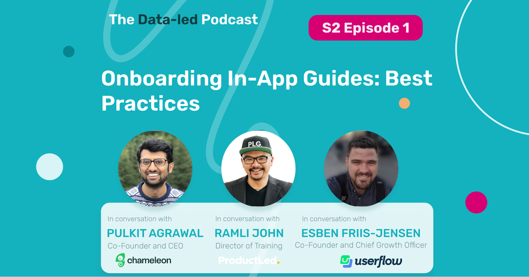
In the first episode of the second series of the Data-led Podcast join not one, but three special guests:
Ramli John, Director of Training at ProductLed, Esben Friis-Jensen, Co-Founder and Chief Growth Officer at Userflow, Pulkit Agrawal, Co-founder and CEO at Chameleon,
and our hosts Claudiu Murariu, CEO and Co-Founder of InnerTrends, and Arpit Choudhury, Founder of Astorik and Data-led Academy, as they discuss successful trends for building in-app guides, how to build an effective in-app guide, the benefits of a short in-app guide, and how to decide between building an in-app guide or fixing a user experience problem directly.
Subscribe on your favorite streaming platform for more episodes:
Listen on Apple Podcasts Listen on Spotify Listen on Google Podcasts Listen on StitcherWhat is the onboarding process?
The onboarding process is the moment from which a user creates their account with your product or app, to the moment when the promise of your product or app is delivered to them for the first time.
This promise is the value that your product or app can deliver to him or her. Let’s see how in-app guides can help this process.
What does an effective onboarding process look like?
[Ramli]: Seeing a progress bar or where people are [in the onboarding process] is such a useful gamification. It’s a principle we see in video games called the Zeigarnik Effect – when two or three steps are already checked off, you’re more willing to continue. It’s a great tool that, in sign-ups, really gets people moving.
It’s a very subtle way to encourage people to complete the onboarding, rather than trying to incentivize them with money or more free space, etc. It’s something that I’ve seen works really well and more companies are using progress bars to get users to successfully flow through their onboarding.
There’s also a concept called the sunk cost effect: if you’ve already made an investment of time or money into something you’re more likely to go through with it.
An example of this would be Calendly – if you connect your Google Calendar to Calendly, you’re more likely to stick around because you’ve now made that commitment a little bit.
In onboarding, the sunk cost works in a positive sense – if they’ve made that investment, put in their time and effort to connect their Google Calendar, put in that extra effort to customize a bot and call it the “Ramli Bot,” that customization creates a sticky effect. They’ve put in that sunk cost already, they’re less likely to pull back out.
How do you build a successful in-app guide?
[R]: I see product tours being used more and more often. But most of the product tours are … bad (ha, ha). For example, product tours don’t have a clear understanding of the promised land. They don’t have a clear understanding of the positioning, the value, and what user success looks like. All of that takes time to understand.
So what happens is the product tour often becomes “let’s point everything out.” It’s like going into Walmart and somebody grabs your hand and starts pointing out every single thing: ”Hey, Claudiu, here’s a tomato. Hey Arpit, here’s canned peas.” But all I need is some toilet paper. Why are you pointing everything out?
When there’s an unclear sense of what user success is, it will be unclear where everything is guiding.
Every word, every tactic, every in-app guide, every email should lead the user to the promised value.
[Arpit]: Implementing a guide is not just about the technical aspect of implementing a third party tool that helps you build a guide, or actually building that guide inside that tool. It’s not just about doing that work. It’s a lot more than that.
Whoever’s building the guide has to have a very clear understanding of the product. They have to understand what user success looks like and what the shortest path to success is.
If you bring in an expert who is really good at building in-app guides, but has no context of your product or customers, no matter how good of a designer they are, their guides are unlikely to succeed. Whoever’s building the guide has to have a lot of context as to why the guide is being implemented in the first place.
[Claudiu]: In-app guides are designed to help the user. Trying to help somebody that doesn’t need help is really annoying, because it becomes Ramli’s Walmart example.
Here’s an example of a process InnerTrends customers use to implement in-app guides.
First, they check out the onboarding step where they have the biggest drop off. Once they identify that step, we have a dedicated report that informs them of what actions users perform between that step and the next one.
InnerTrends automatically puts everything into three buckets: actions that have a positive, negative, or no influence on users getting through.
And that is used as the starting point of our customers in-app guides. You want to guide users towards those actions that have a positive influence, because the more users do them, the more users will be successful. You want to drive users away from actions that have a negative impact to get them back on the right track.
So instead of building a guide beginning to end, you need to identify a very clear problem within a very clear onboarding step through a very clear set of actions, and do a very short guide there to try to address the problem.
What are the benefits of shorter in-app guides?
[Pulkit]: One step guides have – obviously – the highest completion rates.
There is a big drop off after four steps. So we always recommend that our customers create short guides, and to make sure each step is valuable and compelling. Don’t waste someone’s attention.
The average completion of in-app guides across all industries is 47%. And there’s a lot more data and benchmarks in Chameleon’s Product Tour Benchmarks Report that we release every year.
Users typically spend about 89 seconds on a guide – that’s how much you’ve got, a minute and a half. You need to use that time well. Users lose attention after many steps, and they can’t absorb all of the information at once.
We recommend breaking it down into shorter guides that are relevant to what the user is trying to accomplish. Don’t try and show everything in the product all at once. Try to really address the friction points that users might be facing in a way that they would find to be helpful.
[Arpit]: Shorter guides are great if your product allows you to build shorter guides. But there are certain products where this is not possible – the nature of the product is such that a three step guide will not really achieve anything. You need to experiment and see what works. There is no one size fits all rule, so context is everything. If you can condense your guides down and trigger them contextually, that’s the key.
[Esben]: Of course, one step guides have a 100% completion rate. But beyond that, when looking at the use of flow data and your own industry data, we see that guides with two to five steps have the highest completion rate; it’s around 50%. As soon as you move above five steps, it drops to around 40% completion. And actually, if you go beyond that to 20 or 30 steps, it doesn’t drop that much – it stays around 40%.
In general, we see a completion rate of 40-50% if you exclude the one step guides that have a natural 100% completion rate.
It’s important to keep in mind that fully completing a flow is not necessarily a need to reach your goal of activation, conversion or retention. Sometimes just a sub part of a guide is enough to make the user understand that functionality and get them to that “AHA!” moment.
How do you decide between building an in-app guide and actually fixing a user experience (UX) issue?
[E]: If you’re truly having a UX problem in your product, I would always aim for fixing it within the product experience itself.
But the power of no-code guides can be that they’re deployed faster, so you don’t have to wait around for engineering to get to that UX item. That means you can use a no-code guide as an MVP of that UX solution, or as a stopgap.
Having said that, I don’t think the main use of guides is to cover for bad UX. Rather, it’s a tool to drive attention towards new or unused features, or key “aha!” moments. This isn’t easily done via native UX improvements, so that’s why no-code guides are valuable.
Conclusions
- Go for shorter guides – make them relevant to what the user is trying to accomplish.
- Use in-app guides to drive attention towards new or unused features, or key “aha!” moments.
- In-app guides are a great way to test and experiment with communicating your product’s value in different ways. Whenever you have an idea, instead of simply going and developing indirectly in the product, you can test it with an in-app guide.
- You should always ask users if they want the in-app guide because some users simply don’t.
- There are amazing tools on the market – two of them featured here – Chameleon and Userflow – that can enable you to build great in-app guides; remember that it’s time-consuming and requires a lot of effort, and not every user will interact with your in-app guide. But it will have a positive impact on those that do.
Have any additional questions about customer data tracking, or other topics you would like to hear covered on The Data-Led Professional Podcast? Comment below! We can’t wait to hear from you.
Subscribe for more episodes on your favorite streaming platform or subscribe for InnerTrends updates here:
Listen on Apple Podcasts Listen on Spotify Listen on Google Podcasts Listen on Stitcher


