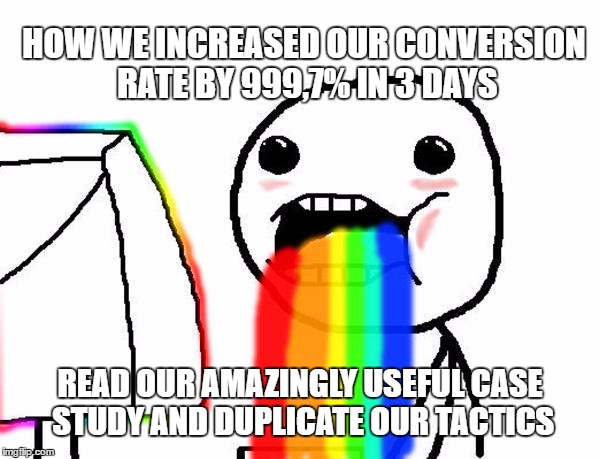
There are lots of articles out there that tell you what to do in order to increase your conversion rate, and they all make it look like it’s child’s play. They’re really fun to read.
You nod your head and get excited every time you see how they increased their conversion rate by another 999.7%. You might even relate to this guy right here, I know I do!
It all sounds amazing in theory. However, when it comes to implementing the same framework to run the experiment on your own business, you’ll find out pretty quick that it wasn’t as easy as you were led to believe.
There’s no universal framework that works for every business.
Instead of bragging about how we increased the conversion rate by 21%, which was no small feat, we want to show you the huge amount of effort and the coordination it took to overcome the challenge!
Our work ultimately translated into an increase of $18.000 to 123FormBuilder’s MRR.
The Conversion Rate Optimization Challenge at 123FormBuilder
123FormBuilder was looking to identify the best approach for their business when it comes to growth. They were allocating a lot of resources towards user acquisition.
Multiple projects were being run at the time in order to find out which one would be the best fit for their business, but they kept bumping into the same wall.
The marketing team at 123FormBuilder realized that something is fishy and began investigating their conversion funnel. They were able to see that most of their traffic was getting lost during the last steps of the conversion process.
They started asking questions to figure out how they can get to the root of what’s causing the users to leave. These were some of the questions that they started looking into:
- How many users check the pricing packages?
- How many users start placing an order?
- How many users finish ordering an item?
It was the first time 123FormBuilder had encountered this issue. Their marketing department had an internal meeting to look over their options and see what can be done to optimize conversion rate.
They were quick to realize that it would be best to reach out and make use of all the resources and connections to see if anyone had a similar experience.
123FormBuilder needed someone who had experience with conversion rate optimization so they reached out to Avangate.
On the other hand, they needed an expert’s opinion to help them make sense of their data, so they reached out to us at InnerTrends. They heard about The Experiment that we run and wanted to give it a try.
Once the whole party was summoned, it was time to move on to the next step and set up a kick-off meeting to discuss the details of the project, and come up with a plan to optimize 123FormBuilder’s conversion rate.
Project Setup: Planning Our Conversion Optimization Strategy
As every great tale, it all starts with a meeting. The people present at our meeting were:
- Irina, 123FormBuilder’s Marketing Manager: she was in charge of user acquisition and she was the one to realized that the amount of resources they’re investing into acquiring new users isn’t paying off as well as it should.
- Delia, Avangate’s eCommerce Specialist. Avangate is 123FormBuilder’s payment processor. They were expected to have answers for at least a few of our questions.
- Claudiu, InnerTrends’ CEO and Web Analyst. We liked the prospect of this experiment a lot and chose to help 123FormBuilder optimize their conversion rate.
The point we’re trying to make is that you should never charge into the battle all by yourself. Making rash decisions that aren’t based on accurate information can do more harm than good for your business.
Here at InnerTrends we are strong advocates of data-driven business decisions. We are well aware that there might be certain scenarios where you end up in a tight spot without any data, but that should give you all the more reason to reach out to those who’ve been through similar experiences.
Putting all of our experience together helped us juggle 123FormBuilder’s challenges with much more ease.
During the meeting we tried to get a good understanding of the challenges 123FormBuilder was facing. We wanted to know if they had any data we could use, if they ran other similar projects, and what resources they would be able to allocate to this project.
We established a timeline, set the expectations for our project, and outlined the following plan:
1. Analysis Setup – ETA: Sep 25
2. Getting the SaaS oriented tracking code ready – ETA: Sep 28
3. Implement the tracking code in the purchase cart – ETA: Sep 30
4. Collect the data through analytics: ETA: Oct 31
5. Data analysis and coming up with experiment hypothesis: ETA: Nov 6
6. Step by Step Experiment plan – ETA: Nov 6
7. Meet with the client to discuss the plan – ETA: Nov 9
8. Running the experiment: ETA: Nov 15
We now had a plan for which we estimated a 2 months project. It was time to move to the next step and start putting the plan into practice.
Analysis Setup: Finding the Current Conversion Rate
First things first. We had to check the analytics tool and see what was currently going at 123FormBuilder. At the time they were using only classic analytics tools, and they were reporting a conversion rate of 40% for the total amount of users who reached the shopping cart.
This was the point where we noticed the first red flag. Claudiu realized he ran into a similar experience at his old company, PadiAct. They were having a conversion rate that didn’t really reflect the numbers they were seeing in their revenue.
The team began looking into the issue that Claudiu raised and the next step was to figure out if 123FormBuilder’s analytics service was reporting the correct conversion rate.
We went ahead and changed the way the actions that visitors performed were tracked: we started looking at how many users logged in, instead of sessions.
After analyzing the same data we got a totally different conversion rate: 85%!
Classic Analytics Tools vs. SaaS Specific Analytics Tools: What’s the Difference?
The classic analytics tools identify users based on cookies. As our data revealed, this wasn’t the most reliable option for SaaS companies
If you only check the number of sessions a user spends on a website, you might end up with skewed data. Here’s why:
Let’s say that John, a user, visits your website and decides to add an item to the cart. He then sees that he needs to enter the details of his business. He has to submit a request to the accounting department in order to get access to the company’s payment details.
He comes back the second day, but he realizes that he also needs a VAT id in order to complete the purchase. He is only able to get the VAT id on the third day, and that’s also when he successfully completes the purchase.
Now, if you were to have a look at the reports from classic analytics tools that are reporting the conversion rate based on the number of sessions, they would tell you that out of three sessions, only one has completed a purchase. Resulting in a conversion rate of 33%.
When reporting based on sessions you disregard the fact that it’s the same good ol’ John who kept running into trouble on every occasion.

On the other hand, SaaS specific analytics tools would be able to tell you that it was John who visited the website during all of these three sessions even from multiple devices. One login, one purchase. A conversion rate of 100%.
123FormBuilder decided to use InnerTrends to help them with the business intelligence. These are the insights we were able to provide:
And in trended mode:
After making sure that the users actions will be reported accurately, we mapped out the journey that the users had to go through: from the signup to the purchase confirmation.
We started looking into how and where are users making a purchase, and tried to understand what was happening. Pinpointing a single user profile or mapping the exact journey that the users would follow was pretty difficult.
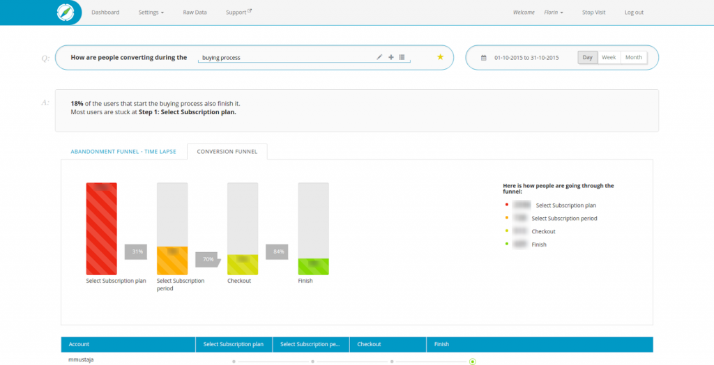
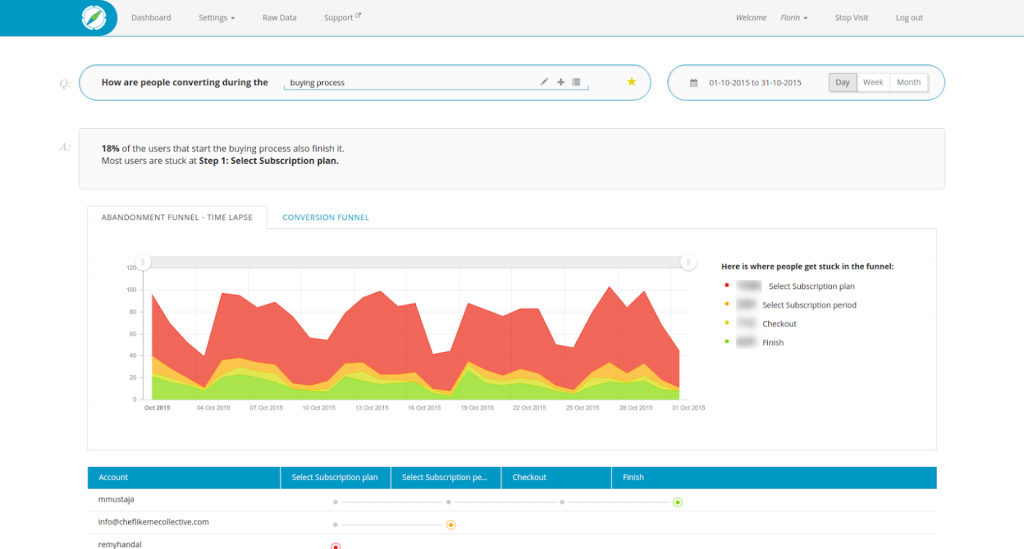
We had to break it down a bit further and segment the users into separate groups to see analyze the actions they performed on the website. We set up the four steps sales funnel and began tracking the actions that the users were performing during these steps.
Day 35: Data Analysis and Coming Up With The Experiment Hypothesis
We had collected enough data to help us draw a conclusion for it. We had a meeting in which we discussed what we learned from the data.This is the actual email we sent to the team after the meeting:
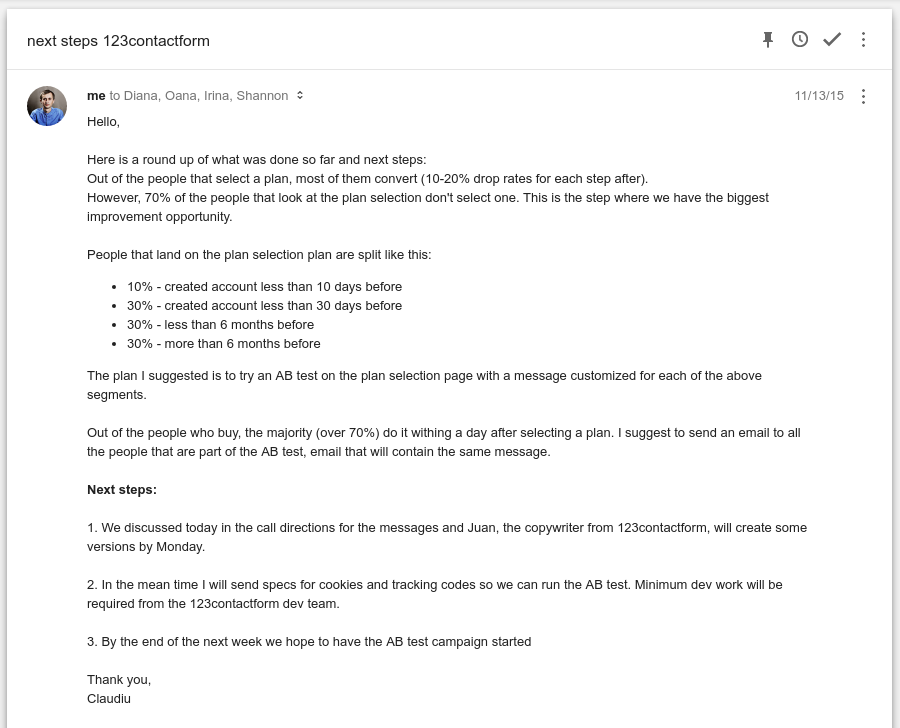
Here is a roundup of what was done so far and next steps:
Out of the people that select a plan, most of them convert (10-20% drop rates for each step after).
However, 70% of the people that look at the plan selection don’t select one. This is the step where we have the biggest improvement opportunity.
People that land on the plan selection plan are split like this:
10% – created account less than 10 days before
30% – created account less than 30 days before
30% – less than 6 months before
30% – more than 6 months before
The plan I suggested is to try an AB test on the plan selection page with a message customized for each of the above segments.Out of the people who buy, the majority (over 70%) do it within a day after selecting a plan. I suggest to send an email to all the people that are part of the A/B test, email that will contain the same message.
Next steps:
1. We discussed today in the call directions for the messages and Juan, the copywriter from 123FormBuilder, will create some versions by Monday.
2. In the meantime I will send specs for cookies and tracking codes so we can run the A/B test. Minimum dev work will be required from the 123FormBuilder dev team.
3. By the end of the next week we hope to have the A/B test campaign started
Since we couldn’t get the dev involved in this just yet, we had to devise another plan. We came up with a quick hack and decided to run a Minimum Viable Experiment first so we get more data.
This approach would require minimum involvement from other departments. The purpose was to run a large amount of tests that would help us learn what’s happening. We weren’t looking to pick a winner.
We planned to use that data to convince the dev department that fixing the pricing page is a priority for the business.There wasn’t even time to setup an A/B testing service, we decided to go ahead with a Google Tag Manager setup.
This was a quick growth hack we were able to implement without having to involve the 123FormBuilder’s dev team to ask them for its implementation.
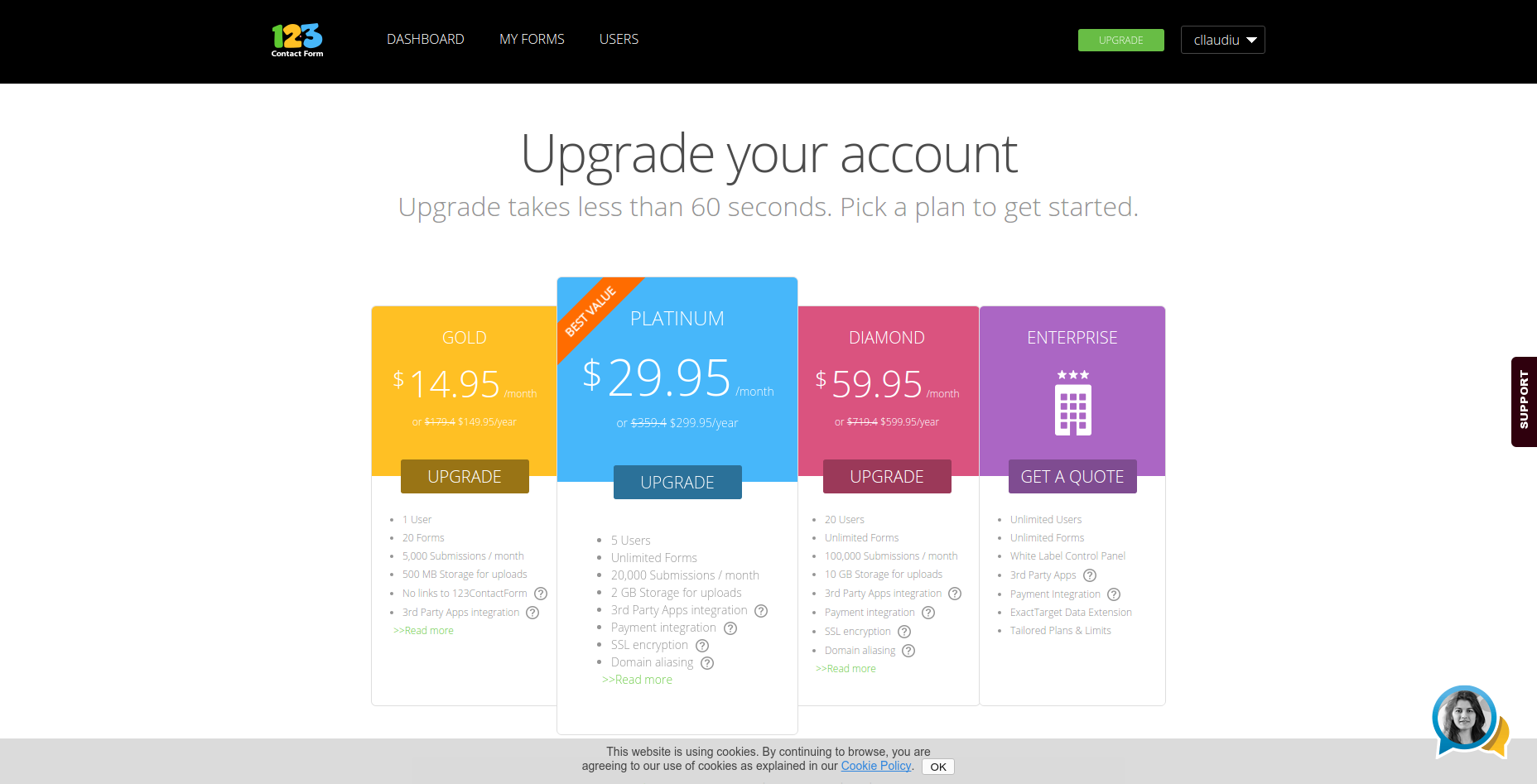
The pricing page had two elements which could run A/B tests on:
- The heading
- The pricing plans
Identifying the exact reason that could tell us why users were purchasing or abandoning the process altogether seemed out of our grasp.
Once we figured out each step that the customer had to go through, we set up the four steps sales funnel and began tracking the actions that the users were performing during these steps.
123FormBuilder began sending the traffic towards the pricing page. We had to wait until we could gather enough data for the numbers to be statistically relevant.
When it was collected, data showed that most users were lost in the first step of the funnel when they got to the page showing the pricing plan. All the users on which the experiment was being ran already had their accounts set up.
The reason behind this is that visitors can complete the purchase without having to create an account with 123FormBuilder. Because that segment had their goal set in mind and knew exactly what they had to do in order to achieve it, we decided to leave it out of our analysis.
When we started looking at that pricing page, we weren’t able to identify any things that would put users off. Their pricing page was typical for a decent SaaS company.
Being a top of the funnel problem on a page whose only role is that of helping users just choose a package, we decided to treat it as a marketing and communication problem. Whatever was causing the lack of user engagement had to be caused by the way in which the message was being communicated to them.
Because we were running our Minimum Viable Test which required us to maneuver as quickly as we could, we decided to test only one of these two elements. We ignored the pricing plans for the time being, and focused on the headline that the users were seeing.
Every new headline was tested against the old one for each of these customer profiles. They were split in three because these were the user categories we identified after the segmentation. Here are the new messages that we decided to display to each user category:
- Less than 10 days old: Message focus: urgency and presenting the benefit of quantity of collected data
- Between 10 days and 1 year old: Message focus: more benefits for upgrading
- More than 1 year old: Message focus: discount (up to 20%)
We began testing each separate headline and it didn’t take long until we got the first results. Our expectations were to find out that at least one headline could be declared the winner.
Here are some of the headlines we tested:

When the results came in we were surprised, to say the least.
We found out that none of the headlines we tested were making any difference, not even the one offering a discount of 20%! They didn’t improve the conversion rate, nor did they have a negative influence upon the user’s decision to complete the purchase.
But this wasn’t all bad news. It only went to prove that there wasn’t any issue with the headline that 123FormBuilder displayed on the pricing page.
At that moment we understood that the actual problem was with the pricing table. We used what we learned to build a strong case against the pricing table, and went to the dev with all of our documentation
Day 65: The Results of the Experiment
This was the email that was sent to the team after the A/B test:
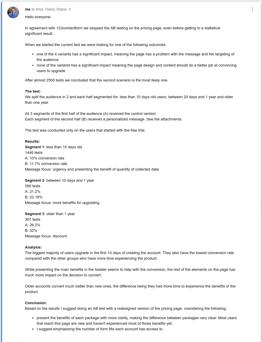
Here’s the body of the email:
Hello everyone,
In agreement with 123FormBuilder we stopped the A/B testing on the pricing page, even before getting to a statistical significant result.
When we started the current test we were looking for one of the following outcomes:
- one of the 4 variants has a significant impact, meaning the page has a problem with the message and the targeting of the audience
- none of the variants has a significant impact meaning the page design and content should do a better job at convincing users to upgrade
After almost 2500 tests we concluded that the second scenario is the most likely one.
The test:
We split the audience in 2 and each half segmented for: less than 10 days old users, between 20 days and 1 year and older than one year.All 3 segments of the first half of the audience (A) received the control version.
Each segment of the second half (B) received a personalized message. See the attachments.The test was conducted only on the users that started with the free trial.
Results:
Segment 1: less than 10 days old
1446 tests
A: 10% conversion rate
B: 11.7% conversion rate
Message focus: urgency and presenting the benefit of quantity of collected dataSegment 2: between 10 days and 1 year
590 tests
A: 21.2%
B: 22.18%
Message focus: more benefits for upgradingSegment 3: older than 1 year
307 tests
A: 26.2%
B: 32%
Message focus: discountAnalysis:
The biggest majority of users upgrade in the first 10 days of creating the account. They also have the lowest conversion rate compared with the other groups who have more time experiencing the product.While presenting the main benefits in the header seems to help with the conversion, the rest of the elements on the page has much more impact on the decision to convert.
Older accounts convert much better than new ones, the difference being they had more time to experience the benefits of the product.
Conclusion:
Based on the results I suggest doing an AB test with a redesigned version of the pricing page, considering the following:
- present the benefits of each package with more clarity, making the difference between packages very clear.
Most users that reach this page are new and haven’t experienced most of those benefits yet.- I suggest emphasizing the number of form fills each account has access to.
We took our findings and went back to the dev team to ask them for help.
Knowing that they’re losing 70% of their potential customers on the pricing page, and that the problem lies within the pricing page design, not with the header that was communicating discounts up to 20%..
We told them that we’ve tried segmenting the users, convey urgency through the messaging on the page, but we didn’t end up with an outcome that had statistical relevance.
It became pretty clear to everyone from that point on that the little monster who was causing the users to abandon the shopping process, was hiding inside the pricing table.
The dev team was able to make the required changes in order to conduct further A/B tests and improve the conversion rates.
They came up with a pricing page redesign which they displayed to visitors (people who didn’t signup yet). This is how the new pricing page looks like:
And here are the results of their A/B testing:
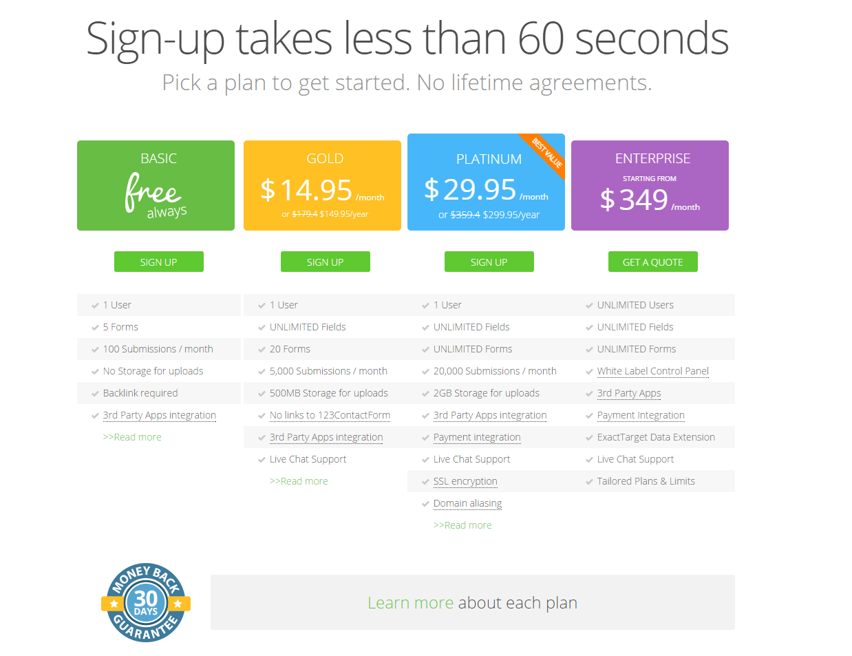
The likelihood of a new user signing up increased by 21%, from 17% to 21%.
Conclusions
It all started out with an issue that received very little attention and was hardly considered to be an actual problem that could affect the business. We were able to identify it, collect data and come up with a plan to fix it.
It was a demanding process. We planned an experiment that was supposed to run for two months, but we ended up running it for four months instead.
It’s supposed to be hard. If it were easy, everyone would do it. – Tom Hanks
There were multiple companies involved, and we had to fight off a lot of challenges before we could even reach to the bottom of this.
We had very little resources at our disposal, but we were able to use them efficiently and we ended up collecting the data that helped us prove our point. 123FormBuilder increased their conversion rate by 21%, which also translated into an increase in revenue.
Looking for deep insights into how your customers use your product?
InnerTrends can help. You won’t have to be a data scientist to discover the best growth opportunities for your business, our software will take care of that for you.
Schedule a Demo with us and witness with your own eyes just how powerful InnerTrends can be.